Case study
Change of ownership
Vodafone NZ.

Two years at Vodafone, across several projects. The core mobile eCommerce redesign, the B2B self-service portal, and customer-led migration journeys. On the eCommerce work I held the system view across squads while the platform underneath was replaced. I've written up change of ownership because it's where I reframed what we were being asked to build.
When one business buys another, the telco services have to move across with it. For Vodafone's business customers that was a high point of churn. Nearly 30% of customers in that situation left rather than complete the transfer.
The process was a four-page PDF. One business filled it in, printed it, signed it and sent it to the other. The second business printed it, signed it, scanned it and sent it back to Vodafone. Any further communication went to one of the two parties, not both.

Some customers raised privacy concerns as well. They were putting their details on a document that a company they were mid-transaction with would keep a copy of.
Two parties, two steps
I broke the form down into the jobs being done at each step and separated the two actors.
Once they were separated, it was clear each party could complete their own part independently. Nothing in the process required them to share a document. The sharing was an artefact of it being paper.
It became two forms, one per party, linked by a handoff. The seller completes their part. The buyer is notified and completes theirs. Vodafone receives both. Each business has its own thread.

That removed the privacy exposure on both sides. Neither business saw the other's details, and Vodafone was no longer circulating a document containing both.
Making it tangible before it was designed
Not every team on the project worked with digital design. Describing two separate digital forms linked by an email was not landing.
I built a clickthrough prototype with minimal detail. Not to test it. To make the idea something people could hold.
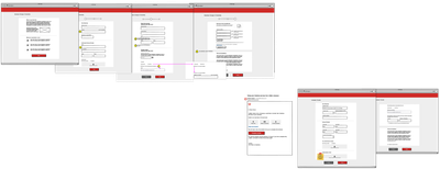
It ended up doing more than aligning the room. The team used it as the introductory requirement for technical exploration, so the architects and developers had the context before the final UI existed rather than after it.
Getting it adopted across two tribes
The project reached more stakeholders than anyone expected — more than two full tribes. At that scale, walking people through a prototype stops working. There are too many rooms.
I made a video showing how the new process would work, and we shared it widely across the business.
Outcome
Processing time went from over ten days to under three.
The brief was to digitise a form. What shipped was a different process. Two businesses no longer had to share a document in order to do two separate jobs.