Reusable Identity Verification
From concept to Product-market fit for VerifiMe
Every time someone opens a bank account, invests in a fund, or buys property — they verify their identity from scratch. Same documents, different forms, repeated friction. VerifiMe wanted to remove this.
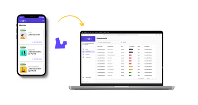
The product had two sides — a consumer wallet where people store and control their verified identity, and an assessments portal for service providers requesting verification. I joined as the sole designer on a small founding team — CEO, a couple of engineers, and me — with no design process, no system, and product decisions being made daily.
The design philosophy that shaped everything
Early product focus was on getting the customers to signup, verify and share using the "wallet" portal. This was contradictory to the users natural workflow.
VerifiMe needed to get out of customers' way. They want to get to the service they are signing up for, as quickly as possible, and not have more steps to do!
The product's job wasn't to be memorable. It was to be invisible enough that users could complete what their service provider needed, without friction or confusion, and move on. The portal would almost run itself if the consumer journey worked.
That reframe — from product as destination to product as infrastructure — shaped the three consumer-facing decisions below, and required some convincing to land.
The challenges
1. A customer journey that felt light
With a focus on learning from customers, we tested some early prototypes. While we received valuable feedback on some aspects, time lags, authentication flows, and trust signals were impossible to simulate honestly in a prototype. So we launched with a small group of early customers who were willing to work through rough edges with us. Real signal, early, while it was still cheap to change. What we learnt was a goldmine.
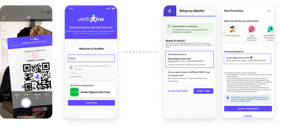
The entry point wasn't trustworthy. A generic VerifiMe email asking users to hand over identity documents was raising suspicion, not confidence.

The team's instinct was to improve the email. I argued it was the wrong mechanism entirely, and that we should replace it — it shouldn't come from us in the first place. I suggested we replace this with provider-specific invite codes embedded in channels users already trusted. It meant the service provider's channel, not VerifiMe's, became the onboarding surface. VerifiMe became infrastructure behind a familiar interaction rather than a brand asking for trust from cold.

This later also formed the backbone for building integrations within systems businesses already use e.g. Xero for accountants.
Account creation was front-loading friction. Early customers also made clear that requiring wallet setup before a first verification — before they'd experienced any reason to want one — was the wrong order. Making it optional raised legitimate concerns about data security and future re-engagement. I worked through those with the team, made the case, and once resolved the confirmation screen became a soft prompt rather than a gate. Users who saw the value opted in. Those who didn't, weren't blocked.

The sharing step was invisible. Most of our friendly users completed verification and stopped. They weren't waiting or trying to log back in, with no signal that there was still something to do. Sharing, the whole point of the product, felt like a separate task for later, and needed individual followup in most cases.
Folding the permission grant into the verification confirmation screen fixed it: the product's value was present at the moment of completion, not surfaced afterward as a follow-up. One interaction instead of two. Drop-off and support requests both decreased significantly.
2. Entity verification couldn't be solved with better UX copy
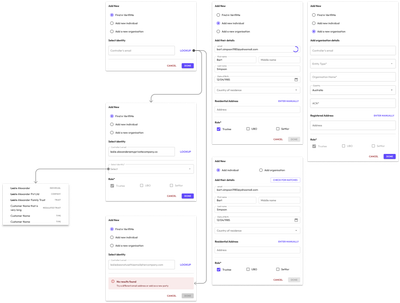
Verifying a trust, SMSF, or company were high value but lower volume transactions, that were essential for VerifiMe to serve a wider range of industries. They involved multiple people across different roles most users didn't fully understand (because they didn't set them up in the first place).
Being new to the domain, I took the complexity at face value — this is just how entity verification works, and the job is to make the form clearer. That assumption was wrong. Several rounds of iteration with updated labels or restructured flow and 95% of submissions still came back incorrect.
It took setting aside the assumption entirely and asking a different question: not "how do we make this form simpler?" but "why are people failing at this regardless of how the form looks?"
The answer: most of these users hadn't set up the entity themselves. A lawyer or accountant had. People who owned and invested as entities were used to concierge like services from their providers. They couldn't interpret the trust deed and weren't confident assigning roles they'd never had to think about. No interface change was going to bridge that gap. They kept asking "can you just do it for me?". That was both the problem and the answer.
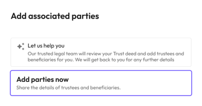
I made the call to stop designing around a self-service assumption that didn't match how this customer type actually operated. Instead, we built internal tooling for VerifiMe staff to handle entity setup from source documents, absorbing the complexity where it could actually be managed, and removing it entirely from the customer experience.

This decision unlocked the financial services, legal, and property sectors — the industries where trust and SMSF structures are standard. VerifiMe now serves customers across a wide range of industries.
What the work added up to
The consumer journey, the entity verification pivot — these were separate problems that shared the same underlying logic: find where the product was asking too much of people, and change what was being asked rather than just how it was asked.
By the time my title changed to Head of Product & Design, that way of working had become the job. Roadmap decisions, backlog prioritisation, customer feedback synthesis — I'd been doing it for a while before it was formalised. On a small team, the designer closest to the customer and the product tends to become responsible for both. The title caught up.
Figma · Miro · Material UI · Maze