Modernising insurance
Lead Experience Designer for redesigning legacy tool used internally at Southern Cross Health Insurance
Background
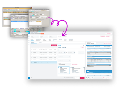
Southern Cross needed to replace a legacy internal platform before its software support expired. The platform served multiple roles — underwriters, claims assessors, quality specialists, team leads — across more than 300 screens. The rebuild was already underway when I joined.
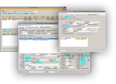
The existing system was functional but ran on end-of-life software and had accumulated a lot of quirks that staff had learned to work around over time. New starters took 6–8 weeks to reach basic proficiency. For claims assessors, who process high volumes daily, that onboarding curve and the ongoing cognitive load had a direct cost to the business.
The starting point
The team had begun with the underwriter workflow — a small user group with lower business risk than claims assessors. User stories were in progress, there was no established design process, and I joined alongside a BA who already owned requirements.
I didn't push for a formal design process upfront. Instead I focused on being useful quickly and building trust through the work.
Phase 1: Underwriters
I started by job-shadowing underwriters — no deliverables, just getting familiar with the domain, the workflows, and where the friction was before proposing anything.
From there I moved into low-fidelity prototypes: quick and rough, aimed at getting real reactions from SMEs rather than approval. I brought BAs in as note-takers, which kept them involved in the design process rather than separate from it.
In parallel I established a visual foundation — a style guide and early component definitions — before the dev team moved too far ahead. The front-end team adopted Storybook. The intent was to build something that would carry through to every subsequent role and team, not just the underwriter module.
Phase 2: Claims assessors
With the underwriter work providing a foundation, the scope expanded to claims assessors — the largest user group and the highest-volume daily users.
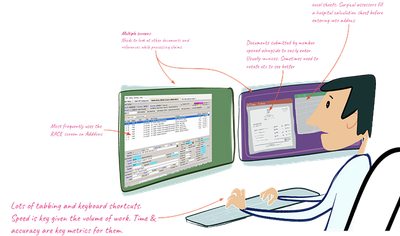
I planned and led 10 interviews with Claims Assessors, Quality Specialists, and Team Leads, supported by another designer and a BA. The interviews were conducted remotely under COVID restrictions, which made understanding physical working behaviour harder than usual. How people set up their screens, which tasks they use keyboard shortcuts for, how they switch between documents — these things are easier to observe in person. We worked around it by asking people to share their screens and walk us through actual tasks in real time rather than describe them in the abstract.
I invited the Product Owner to join some sessions. Having them present for the research directly, rather than receiving a summary after, made a noticeable difference to how the findings were received.
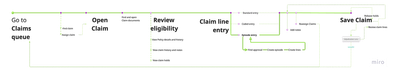
The output was a Current State Journey Map covering the full claims assessment workflow. It gave the team a concrete, shared picture of how the work actually happened and where the pain points were — which fed directly into prioritisation decisions.
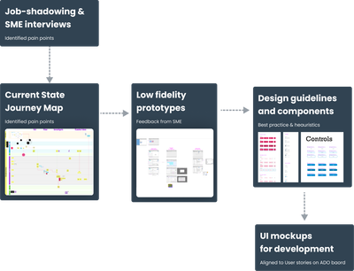
One finding shaped most of the structural decisions that followed. Assessors need the full context of a claim visible at once — documents, history, policy details — not spread across separate screens or buried in tabs. The old system required a lot of mental juggling as a result. Bringing that information into a single view became the foundation for the interface architecture, and most other decisions about what to show, hide, or simplify followed from it.
We ran two rounds of prototype testing — the first focused on overall structure, the second on detail.
UI mockups were handed off against user stories on the ADO board. The design system built in Phase 1 was extended to cover the claims assessor workflows, giving the team a consistent component base to continue building from.
Outcome
I left before the platform launched. Before I left, Southern Cross created two new designer roles for the project — the team had started with none. The design process and component library were in place for the designers who followed.
Tools: Figma, Miro, ADO. Methods: Job-shadowing, SME interviews, journey mapping, low-fidelity prototyping, usability testing, design system.